Raster vs Vector Images: What Every Author with Illustrations Needs to Know
When we work with authors on covers, illustrated books, charts, interior images, or marketing materials, one question comes up over and over: “Why does this image look great on my screen but blurry in print?”
Usually, the answer comes down to the type of image file you’re using.
There are two main kinds of images in the design world: raster images and vector images. Neither is automatically better than the other. They’re simply built differently, and the right choice depends on what you’re making.
Raster Images: Built from Pixels
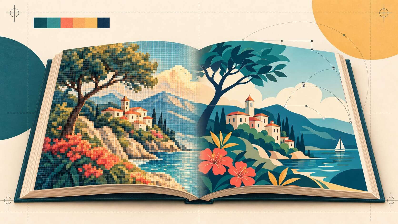
Raster images are made from a grid of tiny colored squares called pixels. Think of a mosaic: each individual tile has a color, and all those tiles together create the image.
Most images you encounter every day are raster files:
- JPEGs
- PNGs
- TIFFs
- GIFs
- BMPs
- Photographs from your phone or camera
- Screenshots
- Digital paintings and scanned artwork
The important thing to understand is that raster images have a fixed resolution.
If an image is 1,000 by 1,000 pixels, it contains one million pixels. That’s all it has. If we enlarge it too far, the computer has to stretch those existing pixels, which is why an image starts to look soft, jagged, or blocky.
Raster is the right format for anything that depends on natural detail, texture, shading, or photographic realism. Photos, paintings, historical scans, textured illustrations, and screenshots all belong in the raster category.
Vector Images: Built from Math
Vector images work differently. Instead of using a fixed grid of pixels, they use mathematical instructions to create points, lines, curves, and shapes.
That may sound technical, but the practical result is simple: vectors can be resized without getting blurry.
A vector logo can be printed on a business card, put on a website header, or blown up for a conference banner, and it will stay sharp every time. The computer simply redraws the shapes at the new size.
Common vector formats include:
- SVG
- AI (Adobe Illustrator)
- EPS
- Some PDFs
Vectors are particularly useful for:
- Logos
- Icons
- Charts and graphs
- Maps
- Timelines
- Diagrams
- Clean line art
- Type-heavy graphics
If an image needs to stay crisp at many different sizes, vector is often the best place to start.
The Practical Difference
Here’s the quick version:
| Concern | Raster | Vector |
|---|---|---|
| Scaling up | Gets blurry/pixelated | Stays perfectly crisp |
| File size | Can be very large at high-res | Usually very small |
| Photographic realism | Excellent — this is what photos are | Cannot reproduce photos |
| Flat illustration / logos | Possible but inflexible | Ideal — crisp at any size |
| Editing flexibility | Limited once rasterized | Fully editable (shapes, colors, strokes) |
| Software | Photoshop, GIMP, Procreate | Illustrator, Inkscape, Affinity |
The biggest mistake we see is treating a raster image like a vector image. A small JPEG cannot be made into a clean, high-resolution print image just by enlarging it. Software can guess at missing information, and AI upscalers can sometimes help, but they can’t truly restore details that were never there.
Why This Matters for Print
For print, raster images should generally be 300 DPI at their final printed size.
For example, if you want a full-page image in an 8-by-10-inch book, you need an image that is at least 2,400 by 3,000 pixels. If your illustrator sends a 1,200-by-1,500-pixel image, it may look fine on a laptop screen but it won’t be large enough for a clean full-page print.
For ebooks, you can often use a lower resolution because screens cannot display as much detail as a printed page. Still, it’s wise to keep a high-resolution master file and create smaller copies specifically for ebook use.
Color matters, too:
- CMYK is generally used for print.
- sRGB is generally used for screens and digital files.
A file can look noticeably different when converted from one color space to another, particularly with bright blues, greens, and reds. If your book includes important artwork, always order a proof and look at the real printed result, and stick to the guidelines for your individual printer because they all handle conversions from one color space to another differently.
What This Means for Different Book Types
🖼️ Picture Books
Picture books are usually raster-heavy because their illustrations tend to be painterly, textured, and detailed. Your illustrator may work in Procreate, Photoshop, or with traditional media that is scanned at high resolution.
For these books, make sure the art is created at 300 DPI for the final trim size plus bleed. If your book is 8.5 by 8.5 inches, the artwork needs to account for the extra space that will be trimmed away around the edges.
Picture-book ebooks can also become large quickly. A 32-page book full of detailed artwork can create a hefty file, which may increase Amazon delivery costs. JPEG compression can help, but never compress your only original file.
📚 Nonfiction Books
Nonfiction books use images in a very different way with charts, diagrams, photographs, maps, screenshots, and technical illustrations that support the text rather than replace it.
Photographs and screenshots should always be raster. Charts, diagrams, maps, and timelines are often better as vectors.
If you take a screenshot of a chart and place it in your book, you’re stuck with that resolution. But if you create or export the chart as a vector PDF or SVG, it can stay crisp in print, on a tablet, in a slide deck, or on your website.
That reusability is a major reason we recommend keeping vector originals for your logo, brand elements, diagrams, and other assets you may use again later. Vector originals are infinitely reusable without degradation, while a raster image might need to be re-exported at different sizes for different uses.
🎨 Graphic Novels and Comics
Most professional comic and graphic novel art is created as a hybrid. Line art and flat colors are often done as vector or at extremely high raster resolution, while shading, textures, and effects are raster-based. The final pages are almost always delivered as high-resolution raster files.
Line art is uniquely demanding. The crisp black lines that define comic art are where raster’s weaknesses show first. At low resolution, lines get jagged (“aliasing”). This is why graphic novel pages need a minimum of 300 DPI (often 600 DPI for black-and-white line art) at the print trim size.
Speech bubbles, sound effects, and captions created as vector text layers stay perfectly sharp and are editable. If lettering is rasterized into the artwork, it can’t be easily translated, edited, or resized.
Also, keep an eye on ebook file size. A 200-page graphic novel can become enormous, which affects both delivery fees and the reader’s experience on older devices even when selling through a retailer that doesn’t charge delivery fees. (Which is about everyone other than Amazon.)
Five Things to Do Before You Start
- Ask your illustrator what format they work in. Do this before they begin, not after the final files are delivered. Fixing an undersized raster file is impossible; re-exporting a vector file at any size is trivial.
- Get the original working files when possible. Keep the PSD, TIFF, AI, AF, SVG, or other native file, not just a compressed JPEG. You’ll thank yourself when you need those assets for merch, a website banner, or a larger trim size in a special edition. Always work with the native file and compress the final file; never try to re-compress an already compressed file.
- Use vector for reusable design assets. Logos, diagrams, maps, icons, and recurring decorative elements should be saved as vectors whenever possible.
- Use raster for photos and textured art. Just make sure it is high enough resolution for the final size where it will appear.
- Test your files on real devices and real paper. Your calibrated monitor is not the same as a Kindle, a phone, or a printed proof.
The short version: raster images are made of pixels and are best for photographs and painterly art. Vector images are made of mathematical shapes and are best for logos, charts, diagrams, and clean graphics that need to scale.