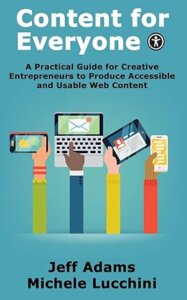
Book Review: Content for Everyone
This review was originally posted in our weekly email newsletter a few months ago. The author has since joined us to talk specifically about the accessibility of eBooks in Training #531. Here are my top takeaways from his book:
 I met Jeff a couple of weeks ago at the Author Alchemy Summit, and purchased a copy of his book after his presentation on accessibility. It's a very quick read that only took me a few days to work through.
Accessibility was something that was very important to me back in the early-2000s when I was “blogging” as a side gig, so I spent a lot of time learning best practices. Over the past decade, I've still maintained those best practices, but haven't kept up to date on the latest resources and recommendations.
The book itself doesn't directly talk much about the accessibility of our books, as it's focused more on our websites and emails. Much of the advice does translate over to our books, however, and Jeff had a lot of book-specific advice in his presentation for both print and digital. Hopefully we'll get him to join us later this year to share some insights specifically how about how to make our books more accessible.
One thing that we have in our favor is that reflowable-text books are inherently accessible by the very nature of how they are designed, and most of the tools available to create them are going to use best practices unless you purposefully override them.
Some of the things that we can do to improve our books, though, is to make sure that we aren't including information that's important to the work solely through the illustrations, and that we include “alt text” on all of the images, even if it's a blank field on a decorate image, so that screen readers know how to interpret that image. Even more important, try to keep anything important to your book as part of the actual text and not only as part of the image, because not every accessibility issue is going to lead towards somebody using a screen reader.
Another way we can keep our books accessible is through our font choice, or in the case of ebooks, not specifying a specific font and allowing the end reader to choose what font they want to read in. (As somebody who does not have accessibility issues, it also bothers me when people force me to read the text of an ebook in a font that they choose rather than the one I want to use…) Chapter titles or other headings can be stylized with special fonts, because they tend to be larger and easier to read, but for the bulk of the text, let the user choose or stick with something that is easy for people to read for your print books.
Color choices can make a difference as well; the book includes resources where you can test the contrast levels between two colors to see if they'll be easy enough to read, and if not you can adjust and tweak the exact colors until they are workable.
If you are looking for ways to make your website more accessible, then this book is a great starting point. It focuses on the changes that an end user for publishing to your website or writing your emails can work with, and barely mentions or skips over anything that requires technical skills or a separate developer.
You can find the book on Amazon* and probably at other retailers as well. Jeff has also generously offered a 50% off coupon if you purchase directly from his website: APEX50
And as an additional reminder, you can spend over an hour with Jeff learning how these concepts apply to our eBooks in Training #531 – eBook Accessibility.
*We may receive a small commission from any Amazon orders at no additional cost to you if you use our link.

