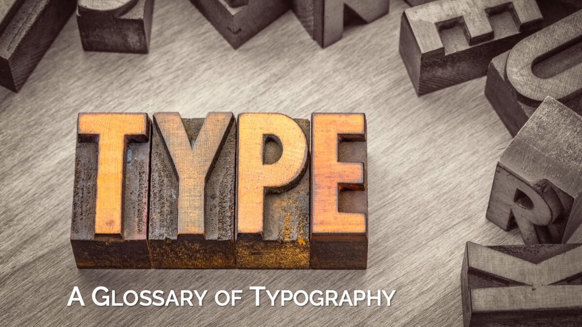
From Serif to Script: A Glossary of Typography
When you pick up a book, your experience is shaped by more than just the words on the page. There's an invisible art at work – typography. It's the visual framework that presents the author's voice, guiding your eye and setting the tone before you even read the first sentence.
Done well, typography enhances readability and draws the reader deeper into the story. Done poorly, it creates friction, making reading a chore regardless of the content's brilliance.
Typography is far more than simply selecting a font from a dropdown menu. It's a critical blend of art and science that impacts legibility, tone, professionalism, and the overall reader experience.
Today, let's look at the common terms you need to know when talking about the words on your pages.
The Basics
Start with the foundational concepts that every reader, writer, or designer should know. These terms define what typefaces and fonts are, and how they impact the clarity and ease of reading.
- Typeface: This is the design of a set of characters. Think of it as the “family” name (e.g., Times New Roman, Arial, Garamond).
- Font: This refers to a specific style or variation within a typeface family. It's the typeface plus its size, weight, and style (e.g., 12pt Bold Times New Roman, 10pt Italic Arial). While technically distinct, in common digital usage, the terms are often used interchangeably, and that's okay for our purposes here.
- Legibility: Can the reader easily recognize individual characters? This is about the clarity of the letter shapes themselves, influenced by the font's design and how clearly it's rendered.
- Readability: How easily can the reader process and comprehend the text over extended periods? This is influenced by how the type is arranged – the font size, spacing, line length, and contrast. Good readability makes reading effortless; bad readability causes eye strain and fatigue.
Font Classification
Fonts come in a variety of styles and families, each with its own history and visual personality. Understanding these classifications helps you make informed choices for any project.
- Serif Fonts: Fonts that are characterized by the small strokes (serifs) found at the ends of the main horizontal and vertical strokes of the letters. Serif fonts are often associated with tradition, formality, and long-form reading, as the serifs are thought to help guide the eye along the line of text in print.
- Sans Serif Fonts: Fonts that do not include serifs. (Sans means “without”.) They generally have a cleaner, more modern, and often more neutral appearance.
- Display Fonts: Fonts designed specifically for headlines and larger sizes rather than body text.
- Decorative & Novelty Fonts: A subset of Display Fonts that are designed primarily for impact and best used in large sizes.
- Script Fonts: Fonts that mimic handwriting or calligraphy.
- Monospaced Fonts: Fonts where each character occupies the same horizontal width. These are mostly used for code blocks or specific design needs.
File Formats
Not all fonts are created equal: the file format determines compatibility, features, and best use cases whether you’re designing for print, digital, or the web.
- PostScript: An older format developed by Adobe and intended for professional output and printing that primarily contained character outlines and was incompatible with TrueType.
- TrueType: An older format developed by Apple (and later Microsoft) and intended for screen display and general computer use that primarily contained character outlines and was incompatible with PostScript.
- OpenType: The modern standard format, developed by Adobe and Microsoft. OpenType fonts are more powerful as they can contain both PostScript or TrueType outlines and advanced typographic features like ligatures, alternative characters, and different figure styles within a single file. This is the format you'll most commonly work with for professional design and for any modern fonts.
- Web Fonts: Fonts specifically designed or optimized for use on websites, enabling consistent and custom typography across different devices and platforms.
Anatomical Terms
Every letterform has its own anatomy, with specific parts and structures. These terms help you recognize and discuss the subtle details that give type its character.
- Baseline: The imaginary line on which most letters sit. It's the fundamental anchor for a line of text.
- X-height: The height of the main body of lowercase letters, specifically measured by the height of the lowercase ‘x'. A font's x-height significantly impacts its perceived size and readability at smaller sizes.
- Ascender: The part of a lowercase letter that extends above the x-height (e.g., the top strokes of ‘b', ‘d', ‘f', ‘h', ‘k', ‘l', ‘t').
- Descender: The part of a lowercase letter that extends below the baseline (e.g., the bottom strokes of ‘g', ‘j', ‘p', ‘q', ‘y').
- Cap Height: The height of uppercase letters, measured from the baseline.
- Terminal: The end of a stroke that doesn't have a serif.
- Counter: The enclosed or partially enclosed space within letters (like in ‘o', ‘p', ‘d').
- Stroke: The main lines that make up letters.
- Stress: The direction of thickening in a curved stroke (vertical, diagonal, etc.).
- Aperture: The partially enclosed, open space in some letters (e.g., ‘c’, ‘e’, ‘s’).
- Shoulder: The curved stroke of a letter (e.g., in ‘n’, ‘h’).
- Spur: A small projection off a main stroke (e.g., bottom of ‘G’).
- Ear: The small stroke that projects from the upper right of the bowl of a lowercase ‘g’.
Layout & Measurement Terms
Typography isn’t just about the letters themselves; how text is measured, spaced, and arranged on the page is crucial for a polished, readable design.
- Baseline Grid: An invisible horizontal grid that aligns the baselines of text across columns or pages, ensuring consistent vertical rhythm and orderly appearance in a layout.
- Indent: The horizontal space added at the beginning of a paragraph’s first line to visually separate it from previous paragraphs, commonly used to signal the start of a new thought or section in body text.
- Font Size: The height of the letters in a font, historically was based on the metal blocks used in traditional printing that included space above and below the letters for ascenders and descenders. There are three common measurements used:
- Point Size: The typical size that fonts are measured in for both print and on screen that is roughly equal to 1/72 of an inch and abbreviated as: pt
- Pica Size: Equivalent to 12 points, or 6 pica per inch. Not as commonly used outside of the printing industry.
- Pixel Size: A digital specific measurement that specifies the height of the letters by the number of pixels on the screen in an application or on a web page. Provides greater control over the layout, but is typically less accessible than specifying a point size which a user can more easily choose to make larger if necessary.
- Em Space: The width of a capital ‘M' in the current font, and often used for measuring a proportional amount that can change based on font choices.
- Measure: The horizontal length of a line of text across a column or page (if there is only 1 column.)
- Leading: The vertical distance between the baselines of consecutive lines of text. This was named from the lead strips used in metal typesetting to provide space between lines.
- Kerning: An adjustment of the horizontal space between specific pairs of adjacent characters to create visually even spacing and a smooth reading rhythm. Kerning can correct awkward gaps or collisions that naturally occur with certain letter combinations (e.g., AV, Wa, To, Ty, P.).
- Metric Kerning: Uses built-in spacing adjustments designed by the font creator for common pairs. Usually the best default for body text.
- Optical Kerning: Software analyzes character shapes to determine optimal spacing. Can be useful, especially for headlines or when mixing fonts, but results can vary.
- Manual Kerning: Manually adjusting space between specific pairs. Essential for display type like headlines, titles, logos, and cover text where subtle spacing issues are highly visible. You generally won't manually kern body text.
- Tracking: Adjusting the overall horizontal spacing uniformly across a range of characters, which could be a word, line, paragraph, or even entire page. Tracking affects all characters in the selection equally.
Character Terms
Letters and numbers have unique styles, features, and combinations. These terms cover the special elements that add both function and flair to your text.
- Figures (Numbers): Modern fonts usually include two styles of figures, which are also known as numbers, for different use cases.
- Lining Figures: Numbers most commonly used for spreadsheets or other digital purposes that have a uniform height, typically matching the cap height of the font. They are easier to scan through columns of numbers without losing your place.
- Oldstyle/Text Figures: Numbers that are designed to integrate more harmoniously with lowercase letters in running text that have varying heights and alignments. They blend into paragraphs of text without interrupting the visual flow or drawing undue attention to themselves.
- Dashes: Dashes are used for multiple purposes, and there are three primary kinds: (—, –, -)
- Em Dash: A dash that is the width of a capital ‘M' in the current font — commonly used to create a strong break in a sentence. It can also be used to add a tangent to a sentence, and is considered about halfway between using commas for a closely related tangent or parentheses for a distantly related tangent.
- En Dash: A dash that is the width of a capital ‘N' in the current font. It is commonly used between numbers, dates, and other data to to denote a range up to and including each end. For example, the letters of the alphabet could be mentioned as the letters A–Z. The en dash is the most difficult character of the three dashes to type, and so is rarely used. (It is often replaced with a hyphen instead.)
- Hyphen: Also known as the “common dash”, it is the shortest of the three dashes. The hyphen connects medial and compound words or word fragments together, such as prefixes and suffixes. Hyphens are also used to connect syllables when a word is broken between two different lines. Because they are easier to type, it has mostly replaced the en dash in every-day practical use.
- Ligatures: Special characters in a font that combine two or more letters into a single glyph to avoid unsightly visual disruption when two letters clash with each other. Ligatures gracefully connect these letter pairs into one smooth, aesthetically pleasing unit.
- Standard/Common Ligatures: Ligatures that are often enabled by default in page layout software and that create ligatures for the most common clashing letters or symbols, most frequently for ‘fi', ‘fl', ‘ff', ‘ffi', and ‘ffl'.
- Discretionary Ligatures: Ligatures that can be enabled for more stylistic reasons rather than just for fixing collisions, most frequently for combinations such as ‘ct', ‘st', or ‘Th'.
- Small Caps: Capital letter forms that are approximately the height of the lowercase x-height that are designed to blend in with a line of text without standing out. Most often used for acronyms (such as NATO), units of time (AM or PM), chapter openings, or for emphasis.
- True-Drawn Small Caps: Unique characters specifically designed by the typographer to match the stroke weight, width, and overall visual texture of the lowercase letters in a font family.
- “Fake” Small Caps: Letters rendered at the approximate x-height of a specific point size in a font automatically through software, for when the software does not support true-drawn small caps or the font does not include them.
- All Caps: Normal capital letters used instead of small caps. These combinations will usually shout off of the page.
If you are curious about dashes and would like specific examples for when and how to use each one, check out our article on Dashes Demystified.
Word & Paragraph Terms
How words and paragraphs are spaced, aligned, and organized affects the flow and appearance of your writing.
- Word Spacing: Managing the space between words to create a consistent layout that avoids distracting vertical gaps (“rivers”) and generally managed through software justification settings and hyphenation.
- Paragraph Spacing: How the start of a new paragraph is signaled. Always choose exactly one method for consistency in body text:
- First-Line Indent: The traditional book method. The first line of a new paragraph is indented. Visually links paragraphs while separating them. Common indent is 1-3 ems.
- Space After Paragraph: Adds a distinct vertical gap between paragraphs. Common in web and business documents. Creates clear separation.
- Paragraph Alignment: How lines of text are arranged horizontally relative to the text column's margins.
- Flush Left, Ragged Right: Text aligns on the left, leaving an uneven (‘ragged') right edge. Often considered the most natural and readable for long text because word spacing is consistent. Requires managing the ‘rag' shape to avoid awkward lines. Preferred layout for large print books.
- Full Justification: Text aligns on both left and right margins, creating a clean rectangular block. Common in traditional books, newspapers, magazines. Requires software to adjust word spacing (and sometimes letter spacing) to make lines fit, which can lead to rivers or awkward gaps if not managed well (hyphenation is key). Requires more skill to implement well than flush left.
- Centered: Each line is centered in the column. Suitable for titles, headings, short blocks (like poetry), but very difficult to read for extended body text due to the lack of a consistent starting point on the left. Use sparingly.
- Flush Right, Ragged Left: Text aligns on the right, leaving a ragged left edge. Like centered text, hard to read for body text. Reserved for specific design effects (captions next to images, sidebars). Suitable for languages such as Arabic or Hebrew with right to left writing.
- Lost Lines: A common type of paragraph composition issue that break the typographic color or vertical rhythm of your text. These can often be fixed in software automatically if there is a “Widow and Orphan Control” settings available, or by manually adjusting the leading and kerning of individual paragraphs.
- Widows: The last line of a paragraph, often just a single word or very short phrase, appearing alone at the top of a new page or column. (Often used interchangeably with orphans.)
- Orphans: The first line of a paragraph stranded alone at the bottom of a page or column, with the rest of its paragraph continuing on the next page. (Often used interchangeably with widows.)
- Runts: A word (or a part of a word) or a very short line that appears by itself at the end of a paragraph without breaking to a new page.
- Gutter: The space between columns of text in multi-column layouts. This also refers to the space in the spine of a book, which is actually a two-column layout with facing pages.
- Margin: The outside gutter to the left of the first column and right of the last column of text.
- Hyphenation: The process of breaking words at the end of a line of text and connecting the parts with a hyphen (-). The word is typically broken between syllables. The primary purpose is to improve the visual appearance and readability of a block of text by adjusting the length of lines to achieve more consistent word spacing and a more even “color” or texture on the page.
- Hanging Punctuation: Punctuation marks that extend slightly beyond the text alignment to improve visual balance.
These terms are just the beginning.
For a deeper dive into the art and science of typography—including practical guidance on choosing, pairing, and applying fonts in book design—explore our Beyond the Font live trainings. They cover everything from type anatomy and spacing fundamentals to advanced layout strategies, font licensing, and expressive typography.
If you found this glossary helpful, you’ll find even more insights and actionable tips in the full program.