How to Create Large Print Books
How many versions of your book are you selling? Some common editions may include the ebook, paperback, hardcover, and maybe even an audiobook edition.
Did you know that there is another popular edition that you can quickly create of your book with minimal extra effort?
Large Print editions are not seen nearly as often when shopping for books from your favorite authors, but there’s a large demand for them. With just a little extra time to properly format your book, you can have another option available for sale for your readers.
What are large print books?
So what exactly is a large print edition of a book? Is it just the same book with a larger font size? Or are there any other modifications that you need to make for your book to qualify?
Most people commonly think that a larger font size is the most important aspect of a large print book, but there are other guidelines that make reading a book easier. You should also consider other aspects of your book, such as line and paragraph spacing, justification, use of white space, and even the trim size of your book.
Large print editions of books are important, not only because they are easier to read for people who have some sort of visual impairment such as the elderly or people who have dyslexia, but also for average readers whose vision is perfectly normal but just prefer less eye strain. Even commuters or folks trying to read when they are tired will appreciate having an easier read of your book.
Large Print Book Guidelines
So what are the actual requirements for your book to qualify as a “Large Print” edition, and who determines what they are?
Organizations such as the American Printing House for the Blind, the Council of Citizens with Low Vision International, the National Association for the Visually Handicapped, and the American Council of the Blind have specific recommendations that you should consider above and beyond what the retailers and printers recommend.
Choose an appropriate font for your body text. Your font should be at least 18 or 20 points, if not larger. Your font should be a sans-serif font. These are fonts that do not include decorative strokes and embellishments on the letters. Avoid the use of decorative fonts, italics, or all-capital-letter text. You should also consider a mono spaced font. Each letter should use the same amount of space. You can also increase the tracking, or the space between letters. Increase the contrast between the text and the background of the page as much as possible.
Emphasis should never use color or italics. It is best achieved through the use of bold text, asterisks, dashes, or by underlining individual words. (If your book will also have an electronic format, then you should reserve underlining words for hyperlinks rather than underlining for emphasis.)
Clearly identify bulleted text with large, solid, and dark bullets. There should be double spacing between each line, and space above and below the bullet list to separate it from nearby paragraphs.
Choose appropriate styling for the paragraphs of your body text. Display your paragraphs in block paragraphs, rather than indented paragraphs, and left align them with a jagged right edge. Also increase the leading (the space between lines) and choose a line spacing of at least 1.5 or even double spacing rather than single-spaced paragraphs to allow for more easily distinguishing between lines of text. Eliminate any widows (a paragraph ending line that falls at the beginning of the following page) and orphans (a paragraph opening line that appears by itself at the end of a page.)
Titles and Headings should be larger than the body text. They should also contain both capital and lowercase letters and (where possible) be left-aligned.
Connect two columns of information with leader dots. This will facilitate being able to cross reference information across space, such as in a table of contents.
Page layout should consider the use of low vision devices. Stand magnifiers and video magnification systems require that the book be placed on a flat surface, so a larger trim size and widened margins are required. Margins should be at least 1” but preferably 1.5” from any edge, with page numbers included in the same font and size as document text in the upper or lower outer edge of each page at least 0.75” from the edges.
Minimize or eliminate the use of graphics and charts, and include them on their own pages where they are absolutely necessary. Never allow text and graphics to overlap, and include adequate spacing between the graphic and a descriptive caption that explains what the graphic represents. Color and hue are less important than including a high visual color contrast.
Choose a suitable paper for your book. Paper should be a minimum of 20 pound bond in order to avoid bleed through, which should not be a problem as all the print on demand companies we recommend default to thicker paper. The paper should have a matte or dull finish to reduce glare. An eggshell color will help minimize eye strain versus a vibrant white color.
Specific Recommendations
The individual retailers and print on demand companies take a minimal approach to what they will consider a Large Print edition. Both KDP Print and Ingram Spark focus on the font size, though Ingram Spark also recommends many of the suggestions above.
KDP Print’s minimum font size is 16 points, while Ingram Spark has two designations. A font size between 14 and 18 points can get you listed as a large print edition, while anything over 18 points can get you listed as a “giant print edition.”
You should really consider going above the bare minimum, however, because your readers that want a large print edition will become much bigger fans if you cater to their actual needs.
It is generally understood that the readability is most affected (in order) by spacing, font size, contrast, and font style. So, those should be the priority when considering a large print edition.
For spacing, consider line spacing between 1.5 to 2 lines with block paragraphs that include a full empty line of spacing between them.
For font size, you will probably not go wrong by choosing an 18 point font.
For contrast, choose a flat black text for the color of your text.
And for font style, any sans-serif font can work well, especially if it is a fixed-width font, but some specific fonts that are often recommended include Verdana, Helvetica, Tahoma, or Arial from Adobe, Linotype’s Futura Light Bolded, and Typography’s Gotham Rounded.
There are also several fonts created specifically considering the needs for visually impaired readers, such as APHont by the American Printing House for the Blind, and Tiresias LPfont by the Royal National Institute of Blind People in London.
Because you are writing and selling books, you have to be careful that the fonts have an appropriate license for commercial use. Some of them, such as APHont, are only provided for personal use only and can not be used commercially.
Formatting Software
There are a few options you can use to format your books that will take into account creating a large print edition. You can use dedicated software to format your print books for you by uploading your manuscript, or you can use typesetting software specifically designed to give you complete control over the layout or your book.
If your budget allows for it, there are two software packages that will format your book for you and both account for Large Print Editions. At the time of writing, the best solution is Atticus, which is an online solution that runs in the cloud. They will give you some simple options to customize your Large Print edition and easily output both a normal edition and large print with little additional work. Atticus currently costs $147.
The next best solution is Vellum, which is a desktop software solution which will only work on Mac computers. Vellum has a few accessibility themes and has some large print trim options that you can choose, but they do not always follow the best practices. Vellum currently costs $250.
If you want the most control over exactly how your book will be laid out, you could also use typesetting software such as Adobe InDesign ($21-$55/mo), Affinity Publisher ($55), or Scribus (free). These softwares will have a higher learning curve, but offer the ability to control every detail of your layout both as a style that applies to your entire book down to the individual pages, paragraphs, or characters.
You could also use the software that you write your book in, such as Microsoft Word or Scrivener, although the amount of control over the print ready output may be a bit lacking when compared to the other solutions.
Other Advantages of Large Print Editions
Providing a large print edition will make it easier for your readers to read your books, and so it can be a good idea to publish one for that reason alone. However, there are a few other considerations that can make it worth the time and effort.
First, there are some genres with readers that will often choose the large print edition if there is one available, but the supply of books that have one available or very low. This can give you a direct competitive advantage when a reader is browsing around and they find that your books tend to have their favorite format available.
Second, you can often charge more for a large print edition. Readers know that a larger font and more white space means that the book will require more pages, which means higher production costs. They are happy to pay a little extra for the convenience of an easier read.
Third, if Amazon is an important part of your sales strategy, creating an extra edition of your book allows you to help train Amazon’s algorithms that you regularly release new content. Even though it is the same book as other editions, Amazon considers it a completely separate product, and they like to see regular releases from an author.
Taken altogether, adding Large Print to your catalog makes sense economically.
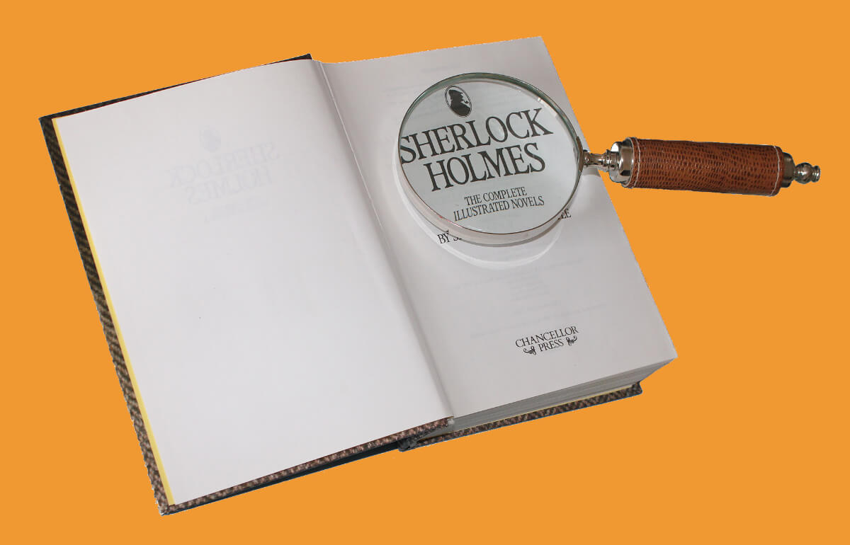
Image by Davie Bicker.