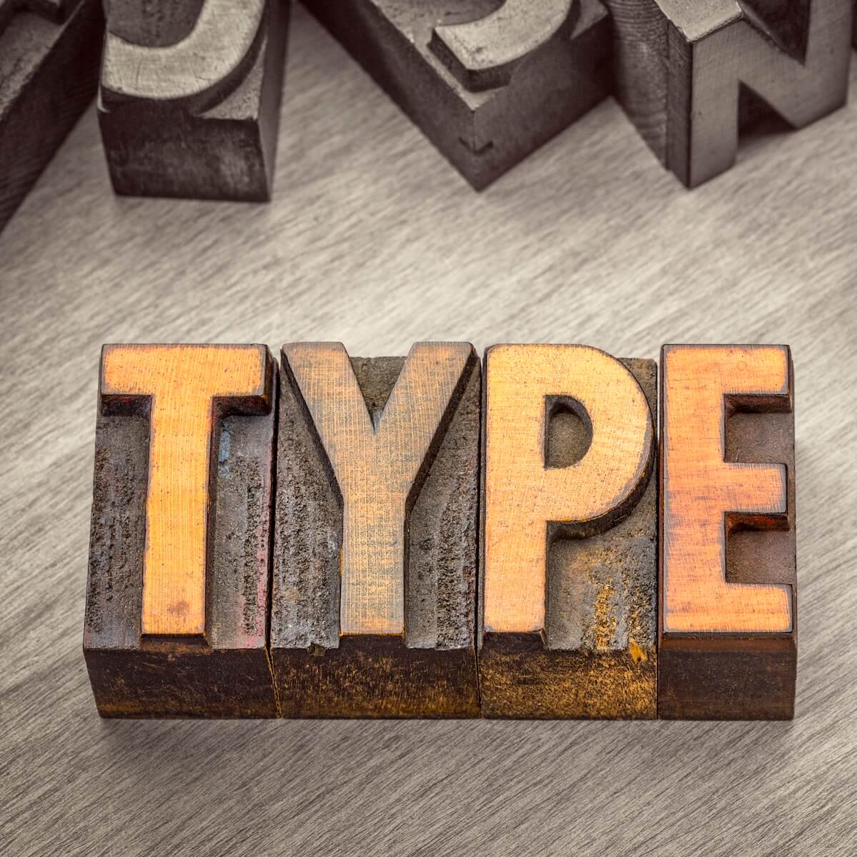
Layout Workshop: The Best Fonts for Your Print Book
One of the best and scariest parts of being a self-published writer is that you have complete control over every aspect of your book. That’s great when we think about artistic freedom, but can be intimidating when it comes to all of the aspects that have nothing to do with crafting sentences and stories.
Layout is one of the worst offenders in this department. Over the next few months, we will cover the major concerns about layout here, to better prepare you for this part of your publishing journey.
Today, we’ll talk about fonts.
It seems like a small matter, but the right font choice can make a book much more pleasant and readable to experience. The wrong font choice (Comic Sans, anybody?) can make your work seem written by an amateur.
Here’s what you need to know about choosing fonts for your print book.
A Tale of Two Fonts
It can be tempting to rabbit-hole down the different font varieties and choose many different fonts for many different parts of the book. It can also be tempting to simplify this decision as much as possible and use one font for every part.
Resist both of these temptations.
Best results come with using two fonts: one for the body text, and one for all of your headers. In fiction, the headers are usually just your chapter names. In nonfiction, you might have headlines and subheads to divide important thoughts and sections.
Either way, it’s that simple. One font for the body text. One font, potentially in different sizes, for your heads and subheads.
If you want to get really fancy and include pull quotes and side boxes, you can add a third font for those sections. However, you’ll usually be better off using your body and headline fonts in there too, just in italics.
Serif and Sans-Serif
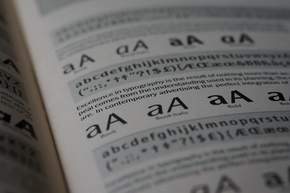
If you’re a typography nerd like me, you know there’s a whole vocabulary to fonts and typefaces. If you’re not, and just want to get your book printed, you only need to know two terms: serif and sans-serif.
A serif is a fancy little line placed at the ends of lines of type. Serif lines have those lines. Sans-serif (borrowing “sans” from the French, meaning “without), does not have those lines.
For example:
Arial does not have the little lines and is a sans-serif font.
Garamond has those little lines, and is a serif font.
Generally speaking (with many attractive exceptions that work perfectly well), most book designers prefer to use serif fonts for the body text, and sans-serif fonts for the headers. Like I said, though, there are many exceptions. You may want to play with different combinations to find out what looks best to you and your beta readers.
Want to learn more about how to choose the right fonts for your books?
See our “Beyond the Font” series!
Learn the foundations of readable type and how to craft & apply your typography.
The Top Ten Fonts for Self-Published Books
Alegreya
A newer, serif font designed specifically for ease of reading, Alegreya is a solid choice for fiction and any nonfiction books that have large blocks of uninterrupted text.
Baskerville
This is a classic serif font, derived for modern word processors off of old typeset dies. It’s a classy, sans serif font you’ll often see on wedding invitations or used for a book’s dedication. It’s hard to read in blocks, but makes an excellent header font for subjects where its baroque feel isn’t inappropriate.
Caslon
This serif font hails from the eighteenth century and was used for many of the classic books of that era we still read today. Unlike Baskerville, this was a workaday font used in books, serials, newspapers, penny dreadfuls, and the like. It’s very readable and a solid choice for body text.
Cinzel
A stylized serif font in all caps, Cinzel is not for body text. It has a lot of white space and a a slightly odd vibe to it. It makes a great header font for fantasy and horror, some styles of science fiction, and some romance genres. A definite wrong note for most nonfiction.
Garamond
A popular font back in the initial days of moveable type, and also the font used in the Harry Potter original runs, it’s one of the few fonts with a name we know the reason for: its inventor, Claude Garamond. It’s a serif body text font with high readability and familiarity. Be alert while choosing it. This font is old enough and popular enough to have spun off several versions and imitations.
Minion
A clear, serif font from the modern era built for readability on screens and on paper. Minion is a favorite among self-published authors and traditional publishers for its regular look and letterforms that look unique while somehow not reducing long-term readability. It comes in a wide array of weights and styles, so you will need to make more decisions with Minion than with many other font options.
Open Sans
This was originally created for header text on web sites, but is also very readable in print. A simple, clean sans-serif font with no surprises. I recommend starting with Open Sans for your header text, and choosing something else only if you like it better.
Palatino
Lovers of this font point out to the decade where this was the most popular serif font used by desktop publishers. Detractors point out this is because it shipped free with Macintoshes during the era where everybody serious about self-publishing used Macs. It’s still a solid choice, though some say over used.
Roboto
Another best of both worlds font, Roboto is a sans-serif option that has robust presence along with a shape very akin to serif body text fonts. You can use it for headers or for body text, and — with a little play in size and weight — for both.
Rosario
This font splits the differents between serif and sans-serif fonts by having weak and partial serifs on some letters. You see it used a lot in textbooks, scientific publications, and other academic spaces. It may feel surprising or even inappropriate in other venues, however.
Spectral
One problem with many serif fonts is they look a little old-fashioned, which is great for horror, fantasy, literary, and historical fiction…but a bit off for science fiction, thrillers, and much nonfiction. Spectral is a more modern serif font, developed by Google, that offers a modern look and is optimized to reduce fatigue for long-term reading.
Honorable Mention: Open Dyslexic
Open Dyslexic, like the name suggests, is a font developed with experts to minimize the impact of dyslexia on the reader. Some readers without dyslexia have reported difficulty reading it in the long form, but it’s a good start on a sticky problem and worth mentioning.
What About Size?
I’d love nothing better than to tell you “body text should be this size for all books, this other size for headings”. But I can’t, because fonts aren’t built to standard. Times New Roman at 10-point is a different size from Cinzel at 10-point, and both are different sizes from Courier at 10-point.
That said, unless you have a good reason for a different size, you want body text to be about the same size as 11-point Times New Roman for most manuscripts for adults. If you choose something other than Times New Roman, you might need to copy and paste a paragraph in Times New Roman next to your chosen font, and experiment with font sizes until you get a near match.
Some exceptions may include genre expectations for your chosen genre, or if you are creating a Large Print Edition of your book.
There’s no good equivalent for your headings. Font sizes vary, as does the size of your page and its layout. The best advice here is to just play with the size until you find what looks good on your book.
Photo by Brett Jordan.