Turning Ebook Covers to Print Covers
Every book needs a cover. And since covers are often the first thing potential readers see of our books, we want those covers to appeal to the right audience. At Apex Authors, we have training and articles about cover, color, and typeface choices. But all of those resources primarily focus on the front cover and, while the front is the part of the cover that sells the book, a print book needs a full wrap.
A full wrap cover for a paperback book consists of a front cover, spine, and back cover in one file. A full wrap for a hardcover book includes all the parts of the paperback cover, and if it has a dust jacket will also include a front flap and a back flap.
If you plan to publish print versions of your books, we recommend obtaining full wrap print covers right from the start. It is much easier to cut a full wrap cover down to accommodate ebooks than to expand ebook covers to accommodate print.
However, some independent authors obtain ebook covers from pre-made book sites or from freelancers who illustrated their books. Some create ebook covers with the help of templates or AI models. Often, those covers don’t include spines or back covers.
In this case, authors are left creating the spine and back cover themselves. When doing so, authors using the print-on-demand publishing method need to take special precautions. Books printed with print-on-demand are more likely to experience shift during the binding and cutting process, potentially leaving a small portion of the front cover on the spine or back or vice versa. Because of this, we encourage authors not to end imagery sharply at any of the cover’s fold points.
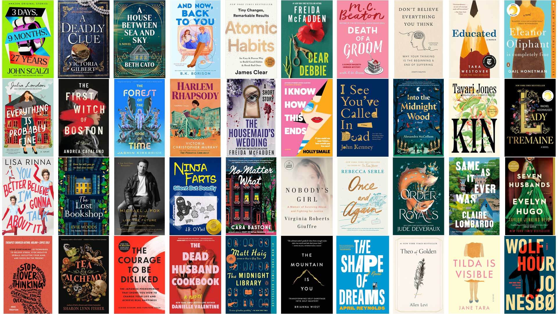
So, what does this mean for you? Let’s take a look at some front covers and determine how we might create back covers. We’ll start with some easy ones.


These books represent several different genres from motivational self-help to psychological thriller to humor to women’s literary fiction to children’s picture books to fantasy.
But the covers all have one thing in common: the images and text all appear on a solid colored background with no elements reaching the left edge.
This is by far the simplest front cover to turn into a full wrap for your print book. Many graphics programs are able to assist you in finding the exact background color of your front image, which you can then include on the spine and back cover, creating a seamless full wrap.
The most difficult part of creating a full wrap from a cover of this style is choosing what will go on the back. If your book is intended for an adult audience, you will likely want to include text about the book and/or you, the author. In that case, you will want to choose a typeface and color that coordinates well with the front cover. You will also want to place the back cover text in a pleasing way, but that will be the extent of your back cover design.
If your book is long enough to include text on the spine, you will also want to make sure you choose a typeface for the spine that coordinates well with the front and back covers.
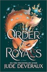
What if you want to include more interesting material on the back of the book? Here are some examples with design elements on the back.


How might you create something like this on the back of your book?
Assuming you aren’t an artist yourself, you probably will need to use an AI tool of some kind. If your book is illustrated, you may be able to add some interest to the back cover by using an AI-powered “grab” tool or background remover to isolate a handful of subjects from your illustrators to use on the back of your book.
If your book isn’t illustrated, but you have an image on your front cover, you may be able to use a generative AI tool to create a complementary image for your back cover.
Still feel that solid backgrounds just won’t cut it for your book cover? Some AI image generators can now replicate visual textures fairly well, if need be. Here are a few examples of very simple covers with textured or gradient backgrounds:


Because it is now often possible to copy background textures, these covers can still be expanded into print covers fairly easily. As you will notice, none of them include imagery that extends to the left edge.
What if your front cover isn’t resting on a solid or simple textured background? What if it includes a full-cover image? In that case, you have two options.
Option 1 is to use a solid spine and back cover and hope the binding machines will bind the book in exactly the right spot (or closely enough that the book still looks professional).
Option 2 is to attempt to carry the front image around to the back. In some cases, you may only need to extend the image slightly while in other cases, you may need an entire image-based back cover.
For most of us, we’ll need to rely on AI to help us with this option. Let’s take a look at a handful of covers and assess how we might create an Option 2-style spine and back cover.
These first two covers have the same issue. The designs include a (more-or-less) plain background, but the image extends beyond the left-hand fold line.

The first book is, of course, an autobiography, and if it were yours, you would have the original photos which you could extend around the fold to the spine. But in other cases, extending the image around the spine and onto the back, if necessary, may be feasible with an image expanding tool or an appropriate prompt from another generative AI tool. This cover only needs a small extension of the hand and shoe.


This second cover could either include just a small expansion of the buildings around the spine to the back, or you could expand even further and include buildings on either side of the back text. That decision could be influenced by the other content you wish to include on the back.
These actual books were printed by off-set printing, so the publishers did not need to worry about binding shift.
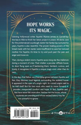
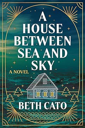
This cover almost counts as a textured or gradient background because of the fairly repetitive nature of the sea and sky image. In some cases, you may be able to simply duplicate the background. In this case, there is a noticeable lightening of the sky on the left side, so an image expansion is likely called for. This will likely require some experimentation and a keen eye.


This book includes a varied sky and grass that continue to the fold. In this case, you could expand the background of the image to cover the entire spine and back of the book. The background is minimal enough that text would be legible.
Alternatively, you could expand the image to only cover part of the back and include a solid background for the rest. (Bonus points if the solid background has an interesting shape.)
The actual back cover does none of these and is a solid yellow.
You might be thinking that your front cover is even busier than those above. How will you make your back cover work? These next two books both wrapped their busy fronts around to the back, but handled the busyness a bit differently.


The designer of this first cover dulled the coloring of the image considerably for the back, allowing the yellow and white text to pop off the background (somewhat; to me, this is still very difficult to read).


The designer of this second cover included a darkened semi-transparent rectangle over the busy background so readers can easily read the back text. The designer cleverly worked the rectangle into the bookshelf so that it doesn’t feel out of place.
Incidentally, in both cases, the main image on the front and back are the same! In the first book, the image is flipped and in the second image, the bookshelf is in the same orientation, but toned down. If you want to use the same image on both covers, you’ll need to do some fancy planning, like lining up the images just right or using a border (like the vines on book two) to help cover up the seam between the front and back.
An important note: If you obtain a custom front cover from a designer, obtain a cover from an illustrator, or use a pre-made cover make sure to read and understand the licensing associated with your front cover. The license could state that the image can only be used for an ebook and no other purpose. The cover could state that the designer or illustrator retains the rights to all derivative works.
Many of these how-tos above are considered derivative works. Whether re-using parts of your illustrated work to create a cover, or using AI generative tools to extend an artwork or create similar images for your back cover; all of these are examples of derivative works. AI makes it easier for us to create these, but that doesn’t ensure you have the rights to do so.
So if you’re stuck trying to convert an ebook cover into a full wrap for print-on-demand publishing, you have a lot to account for. But, the good news is that AI tools may be able to help you make this transition. Always ensure that your creative process respects the original artist's work by verifying that your license explicitly allows for the creation of these derivative designs. By balancing technical preparation with legal diligence, you can create a book that looks as good on a shelf as it does on a screen.